

Ishikawa Ryusei: A New Impression of Kutani Ware
Discover how Ishikawa Ryusei turned from digital content to Kutani ware that stops the eye, then holds it.
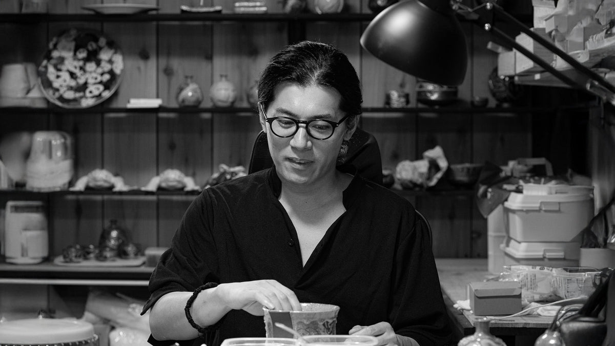
Today, smartphones are part of everyday life, and social media has changed the way we encounter images. A photo may appear on a screen for only a moment before the next one takes its place. Kutani ware artist Ishikawa Ryusei, who spent years producing content for social media, believes that “the endless stream of content has put a lid on modern people’s ability to perceive beauty.”

His response is to create vessels that catch the eye at first glance, then reveal more the longer they are looked at. Deep blue and green grounds, raised blue dots, bold gold, irregular textures, and layers of decoration come together in works he calls “kabukimono.” Rooted in the visual language of Kutani ware, these pieces reflect Ishikawa’s search for a new direction within an established tradition.
Kabukimono: Clear at First Glance, Complex to Make
Ishikawa describes kabukimono as both his art and his vessel. He has two aims for it: an immediate visual impact, and a more demanding process that increases the work required to complete each piece. The initial impression draws people to the vessel. Up close, they find the craft within it. Some works call for sculpted relief and eight to ten firings, with decoration built up in stages.

He writes “kabukimono” (歌舞器物) with the characters for song and dance (歌舞) and adds those for vessel (器物). Read aloud, it echoes kabuki-mono (傾奇者), from the verb kabuku (傾く), meaning “to lean” or “to deviate.” The term described people in the early 1600s who flouted convention through flamboyant dress and behavior. Dances inspired by their style became known as kabuki, later written with the characters for song, dance, and skill (歌舞伎). Over time, kabuki grew into a form of theater famous for its stylized costumes and bold stagecraft, and it still welcomes new subjects and spectacle.
Applied to ceramics, the name suggests a piece grounded in familiar forms and motifs that still leaves room for play, freedom, and individuality. For Ishikawa, this freedom of expression is a way to reinterpret the celebratory spirit and auspicious symbolism inherited from Japanese culture through a contemporary lens. By bringing together familiar motifs and unexpected combinations of color, texture, and decoration, he seeks not only to create a distinctive impression, but also to renew the way people perceive ceramics.
Finding his own way with Kutani ware would take Ishikawa through several different lives before bringing him back to a craft that had been part of his world since childhood.
From Digital Content to Kutani Ware
Before he created his first piece of Kutani ware, Ishikawa held jobs in factories and on construction sites, then spent several years as a firefighter. Today, he specializes in animation, computer-generated illustration, and video production, and produces content for social media creators.
Working with social media eventually led him to think more deeply about digital content and what it means to make something that lasts.
“I reached a point where I began to question producing digital content that is consumed almost instantly,” he writes. “I became interested in making things that have a physical presence and can be passed down.”

Pottery offered a different way of working, with each piece taking shape through forming, drying, firing, and decoration. The process also gave him a way to explore something he had long wanted to do: make things with his own hands. Ishikawa grew up around Kutani ware. He lived next door to a Kutani ware workshop in Nomi City, Ishikawa Prefecture, and as a child he looked forward to the annual Kutani Chawan Matsuri, a local festival that celebrates the craft.
Once he reached financial independence, he decided to make space for pottery in his life. He spent two years studying at the Ishikawa Prefectural Kutani Ware Training Institute in Nomi City, graduating in spring 2026, and entered the field with a clear sense of what Kutani ware meant for him.

Among the techniques he learned, two became particularly important to his practice. One is aote, a style within ko-Kutani that excludes red from Kutani’s five overglaze enamel colors, instead using three or four of the remaining colors across much of the surface. The other, and the one he has been drawn to since childhood, is aochibu, in which the surface is covered with small, raised blue dots, applied evenly one by one. He first encountered it on objects he saw around town.


Learning the techniques was only the beginning. The question was how to make them his own.
New Ways of Combining Kutani Techniques
Ishikawa works with elements associated with Kutani ware, including the aote and aochibu techniques, as well as kinsai (gold decoration), traditional motifs, and layer upon layer of ornament. He brings several methods together and looks for fresh ways to set them side by side.

“I wanted to create something with a new impression, something that wouldn’t resemble anyone else’s work,” he says. “At the same time, I felt that I needed to make something that was unmistakably Kutani ware, something anyone could look at and recognize as Kutani.”
For Ishikawa, originality needs to be grounded in a sense of what makes the tradition distinctive. He wants to understand how it has changed over time, carry forward what came before, and make Kutani ware for the present. He says that pursuing originality without that foundation would be like heading out into the Pacific Ocean. Kutani ware, by contrast, gives him a defined field to work within, with centuries of history behind it. He sees that history not as a limitation, but as a tool.

When deciding what to make, he begins by considering the quality of the finished piece, then explores how established techniques and design elements can be combined in new ways. To his eye, bringing aote and aochibu together in a single form is one such possibility. Each arrangement still has to hold together, from color and balance to texture and the character of each technique.
He also tests different pairings that can produce unexpected results. Liquid gold applied over Japanese overglaze enamels can cause cracking, so the combination is rarely used. Ishikawa treats the cracking as something to explore, asking whether it can become part of the finished surface. He tries these ideas on large pots: “You can’t tell anything from a small sample,” he says. Layering one overglaze enamel over another, or blending Japanese and Western pigments, began in the same way, as experiments that have since become part of how he creates. Ishikawa hopes to continue exploring the textures and surface effects that emerge through repeated overglaze firings, using them to develop new forms of expression.

Building Up the Surface
Ishikawa’s plant pots show how he builds up his surfaces. Although each creation handles color, decoration, and texture differently, they share a common aesthetic.
Aote appears in deep blue, blue-green, and purple, with Ishikawa sometimes adding red, a color traditionally excluded from the style. Aochibu, on the other hand, takes the form of small, raised blue dots arranged in controlled patterns. Kinsai adds bold lines, areas, and decorative elements in gold, often creating a strong contrast against the darker ground. Ishikawa divides the surface into distinct sections and gives each its own treatment.

The bodies are made from stoneware, rather than the porcelain commonly associated with Kutani ware. This gives the pieces another point of contrast: the roughness and character of the clay body against the richness of the gold and the more controlled surfaces of the decoration. In some parts, the surface is smooth; in others, decoration is raised or visibly irregular. Cracked sections add another texture, turning an effect that might normally be treated as a flaw into part of the finished surface.

No two pots balance these elements in quite the same way. On one, aochibu runs in an even rhythm across large sections of the surface, and gold cuts through it in stronger lines and shapes. On another, the dotted areas meet rougher, irregular patches, and the contrast between them carries the piece. Elsewhere, kinsai takes over much of the composition, and the gold becomes the dominant element.

The motifs vary from piece to piece as well, drawing on Kutani ware’s longstanding vocabulary of auspicious symbols. Bamboo and plum appear alongside patterns such as seigaiha, a repeating wave motif associated with peace and enduring happiness, and sayagata, a continuous geometric pattern symbolizing longevity and prosperity. One plant pot also bears the character 福, meaning “good fortune.”
For Ishikawa, these motifs are connected to the idea of engi, the auspicious connections and circumstances that can lead to a favorable outcome. Through his vessels, he hopes to share a wish with those who encounter his work: “May good fortune come to you.”

The message may be simple, but the surfaces are rich with contrasts. Smooth, raised, regular, and irregular elements sit alongside one another. “Stillness and excess, order and collapse,” he writes. This interplay is central to his approach: make the first impression clear enough to stop the eye. Then give the eye a reason to stay.
Stay close to the craft
Now and then, a quiet letter — new stories, seasonal notes, and the hands behind the work.
Im Inneren von Fukusaya: Vierhundert Jahre Castella-Herstellung
Lernen Sie die Nagasaki-Handwerker kennen, die seit vier Jahrhunderten Castella backen, und sehen Sie,…
Tamura Seito: Kalligrafie auf Kutani-Ware, eine Verbindung durch die Zeit
Der Meister der vierten Generation der Kutani-Mohitsu-Saiji-Technik, Tamura Seito, malt Waka-Gedichte in Mikrokalligrafie auf…
Das Handwerk hinter den Stäbchen: Drei Geschichten der Kunstfertigkeit
Wie Handwerker die besten heimischen Materialien und extreme Detailgenauigkeit einsetzen, um Essstäbchen zu schaffen,…
Leave a comment