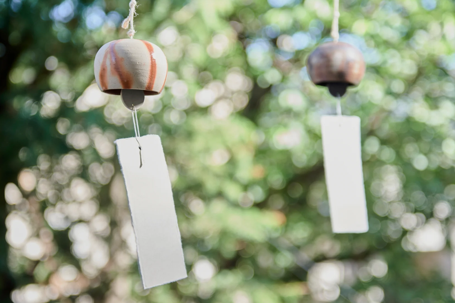
Hataman Touen Iro-Nabeshima Goldfish Imari Nabeshima Ware Long Wind Bell
This wind bell has a beautiful goldfish design in the Iro-Nabeshima (colored Nabeshima) style on beautiful white porcelain.
Using traditional red and blue paints, the artist used a technique called "Dami," in which a thin gradation is added to the line drawing to express the dynamism of the goldfish.
By adding a picture of water plants, the wind chimes swaying in the wind give the impression that the goldfish are swimming underwater.
Goldfish are called "Ching Yui" in Chinese, which is pronounced the same as "extra money," and since ancient times they have been regarded as an auspicious fish that is associated with saving money. It is also said to be a symbol of fertility because it lays many eggs.
Iro-Nabeshima has traditional rules, consisting of one color for Sometsuke (Gosu) and three colors for Akae (red, yellow, and green). After outlines are drawn in gosu, red, "kibi" (yellow), and "moe" (green) overglaze painting is applied to the inside. Although it appears that many colors are used, in fact only three colors are used for overglaze painting, a characteristic of Iro-Nabeshima, and its beauty is considered the pinnacle of Japanese porcelain.
Hataman Touen is a company that aims to "create a new Nabeshima" along with passing on the history and traditional craft of Imari Nabeshima ware, which has continued for 370 years. Based on the belief that "traditional crafts can only be inherited if they are closely connected to daily life, "the company offers tableware that enriches the spirit and sensibility in accordance with modern lifestyles.
NOTE:
Check the strings connecting the wind chime, clapper, and paper strip for looseness before use. If they are loose, tie them tightly.
PRODUCT DETAIL
- Dimension:[Wind Bell] D6cm(2.4in) x H9cm(3.5in) /[Clapper]4.8cm(1.9in)x H2.2cm(0.9in)/[Strip of paper]4.8cm(1.9in)x H18cm(7.1in)
- Material: Porcelain
- Origin: Made in Japan - Imari Nabeshima Ware
- Brand: Hataman Touen
Tag @musubikiln for a chance to be featured
On Instagram
You may also like
Recently viewed
HATAMAN TOUEN
Nabeshima Series
The aesthetic style that Nabeshima ware has carefully maintained as a traditional rule since the Edo Period is composed of one "Sometsuke" color (blue) and three "Aka-e" colors (red, yellow, and green). Those painted in only blue color are classified as "Sometsuke" style. The extremely fine, carefully drawn lines and the light gradations that are repeatedly layered within them create a dignified appearance. The traditional patterns of Nabeshima, which were offered to the nobility, are designed in a sophisticated manner, yet with a sense of glamour.
View more Nabeshima SeriesHATAMAN TOUEN
"Bone from an unparalleled history and tradition"
Hataman Touen is a company that aims to "create a new Nabeshima" along with passing on the history and traditional craft of Imari Nabeshima ware, which has continued for 370 years.
Based on the belief that "traditional crafts can only be inherited if they are closely connected to daily life," the company offers tableware that enriches the spirit and sensibility in accordance with modern lifestyles.
Imari Nabeshima Ware
Nabeshima ware is a porcelain ware produced by the Nabeshima domain kiln, which was established in 1628 by 31 selected potters in the Arita and Imari areas (Saga Prefecture) as a project directly managed by the Saga Nabeshima domain in the early Edo period.
For about 250 years until the abolition of the domain in 1871, the Nabeshima ware, which could only be used by shoguns and feudal lords, continued to produce porcelain masterpieces such as "Iro-Nabeshima (colored Nabeshima)", "Sometsuke" and celadon porcelain, and others as masterpieces of the finest quality. Later, the kilns became private kilns, and new potters joined to create the present Imari Nabeshima ware.