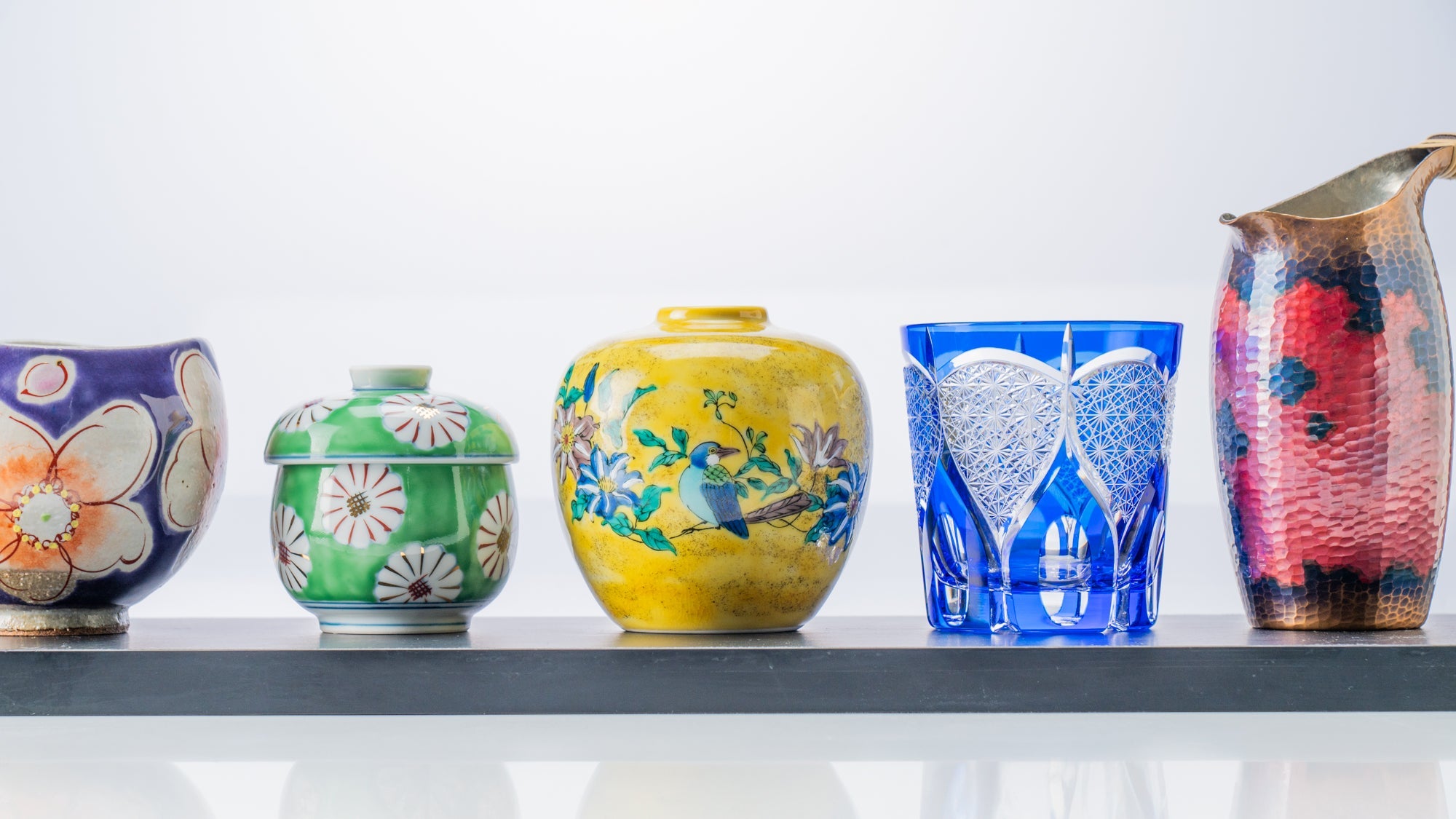
Aesthetics of Japanese Traditional Colors
Written by Team MUSUBI
An island nation with a temperate climate, Japan excites travelers and locals alike with a full range of natural scenery. From magnificent mountains and deep forests to flowing rivers and bountiful oceans, the country’s diverse landscape is a perfect habitat for a wealth of flora and fauna. The lively colors of the land have had a profound influence on the aesthetic sense of the Japanese people and have given rise to a traditional color palette.
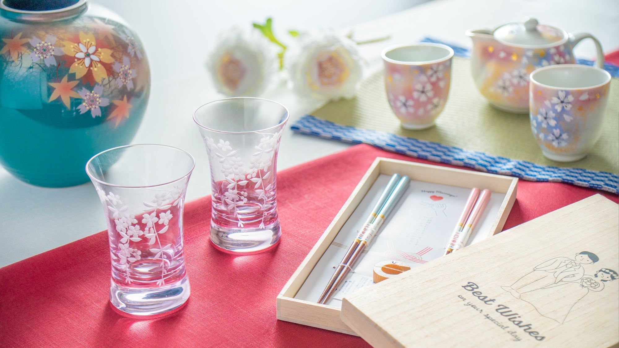
In this guide, we would like to introduce some of Japan’s traditional colors, along with some brief notes on their significance and origins. Japan's rich conception of color has been shaped over centuries through traditional crafts like weaving and dyeing, with many hues drawing their names from native vegetation. Passed down from previous generations, the influence can be felt in many aspects of arts, crafts, and daily life, Japanese tableware being no exception.
Table of contents
The Five Color System according to Yin Yang Philosophy
The philosophy of Yin Yang and the Five Elements was introduced to Japan from China over a thousand years ago and its influence can still be felt in Japanese culture through its connection with Shintoism. According to its principles, five hues, known as goshiki, correspond to the five elements. Red is aligned with the element of fire; green (or blue) corresponds to wood; yellow represents earth; white is linked to the element of metal; and black (or purple) symbolizes water. The colors in this theory were used for fortune telling and amulets, as well as for understanding the balance of various natural phenomena.
Surrounding yourself with various colors that bring you joy can enhance your mood and increase your sense of well-being. Although the colors introduced here are just a few examples, we hope that this can be a stepping stone for you to explore even more of the seemingly endless number of traditional Japanese colors and incorporate them into your lifestyle.
Red Colors
Red is the color of fiery passion, a symbol of life, and also the hue of the setting sun. Vivid red was one of the most precious colors in Japan before the introduction of chemical dyes in the 19th century, as it was extremely difficult to produce the color by dyeing with natural materials. In order to achieve different tones of the highly desirable red color, dyes were created from flowers and minerals.
Beni iro

Beni iro is a deep, plant-based red color derived from benibana, or safflower. Beni also refers to the lipsticks worn by geisha.
Traditional Japanese lipsticks are made entirely from pigments extracted from safflower petals. Only 1% of safflower petals contain safflower pigment, and only a very small amount of dye can be extracted from even two thousand to three thousand flowers.
A coat of the extracted beni pigment spread over the inside of small shells or porcelain vials. It was applied to the lips directly with fingers or else with a brush. The containers of safflower were sometimes made of Arita porcelain, elevating these cosmetics to a work of valuable craftsmanship.
Akane iro

Another Japanese red pigment derived from a plant is akane iro, which is made from the roots of akane, also known as madder. Compared to the bright rose red hue of beni iro, akane iro is a slightly deeper shade of red.
Symbolic of autumn, akane iro has been likened to the color of a cloudless sky at dusk, autumn leaves, and red dragonflies, all of which are unique to this season.
Shu Iro

Shu, or crushed cinnabar, has been used in Japan since ancient times and is considered a sacred color designated for torii gates at Shinto shrines.
Cinnabar, also known as the "Philosopher's Stone" in the West, has antiseptic and mothproof properties when used as a pigment. Its bright orange-red hue was used in vermilion lacquerware in ancient times. In today's vermilion lacquerware, iron oxide is mostly used as a pigment to produce the red color.
Although cinnabar is sometimes considered dangerous, natural cinnabar is non-toxic for use in crafts. And even when cinnabar red is used in vermilion lacquerware, it is only used after proper safety checks.
Blue Colors
Reminiscent of ocean waves, the bright sky, and deep night, the color blue symbolizes clarity and serenity. Blue has long been favored as a color for kimonos, with clear, vivid shades often appearing in plant-dyed fabrics.
In the ancient Japanese language, blue was also sometimes used to express the depth of the color green. Even today, older people sometimes describe the vigor of lush grass and leaves as "blue".
Ai Iro

Ai iro used to refer to a greenish-blue hue during the Heian period (794 CE–1185 CE) and it was not until the Edo period (1603 CE–1868 CE) that it became associated with the dark and rich blue that we know today as indigo. Indigo dye is extracted mainly from a plant called tade ai.
The color was especially popular in Japan around the Edo period and was used everywhere from kimono to noren store curtains. It was also a favorite of many prolific ukiyo-e artists, such as Utagawa Hiroshige, which even led to indigo being referred to as "Japan Blue" abroad. Fellow woodblock print artist Katsushika Hokusai used imported paint similar to indigo blue, but slightly brighter, called bero ai—Berlin blue or Prussian blue.
Gosu Iro

Gosu iro refers to the blue underglaze color used in blue-and-white porcelain called sometsuke, as seen in Arita ware, Tobe ware, and Seto ware. The basic color is a clear, bright blue, but the color may vary slightly depending on the region where the porcelain is produced. Sometimes iron is mixed in, giving the blue a blackish tint.
When made from cobalt, it is called cobalt blue in the West, and was the color of painted porcelain admired by Western aristocrats who imported Imari ware from Japan.
Yellow Colors
In Japan, also known as "The Land of the Rising Sun," yellow and orange have been associated with sunshine and gold for over a thousand years. Yellow also represents light and was therefore reserved for the emperor’s use only. It was considered a “forbidden color” and recipes for its preparation were privy only to the dyers serving the Imperial Court. However, the common people were allowed to wear yellow with hints of green.
Yamabuki Iro

This warm, bright yellow called yamabuki iro takes its name from the flower of the same name, also known as Japanese Kerria. This color is sometimes referred to as kogane iro, which means “golden yellow.”. It was a color that symbolized flamboyance and luxury.
With its vibrant quality it is no wonder that it was favored for use in clothing. It was especially popular as the color of the inner kimono that could peek out from underneath the outer kimono for an eye-catching effect.
Ukon Iro

Ukon, or tumeric, is the raw material for the plant-derived dye called ukon iro. Cloth dyed with turmeric results in a pleasant bright yellow hue, but what’s more it is effective against insects. This makes it both aesthetically pleasing and practical. Turmeric-dyed furoshiki cloth squares known as ukon fu have been used to wrap kimonos and artifacts.
Green Colors
Although green is representative of the natural world, it is actually difficult to produce with dye from a single plant source. It is more commonly created by mixing several dyes, particularly yellow and blue.
In Japan, green conjures up the hues of grass and other plants, but it can also remind us of bird feathers and jewels.
Uguisu Iro

A dusky green similar to the color of matcha green tea, uguisu iro takes its name from the uguisu, known in the West as a warbler, and the delicate color of its feathers. A harbinger of spring, this small bird is known for its distinctive song, which has led to it often being translated as a nightingale for its cultural significance in Japanese poetry, despite the fact that it can’t be heard at night.
With a hint of yellow, uguisu iro is similar to olive green, and the recipe for creating this dye can be found recorded as early as the Edo period. It can be made lighter or brighter depending on the desired mood. In fact, during the Meiji period (1868 CE–1912 CE) a darker shade known as uguisu cha “olive brown” was considerably more fashionable.
Hisui Iro

The color of gem-quality jade, hisui iro has connotations of nobility and elegance. It is a bright green with bluish tints, and is a more delicate shade compared to the vibrant emerald green.
Jade was used in prehistoric Japan, as evidenced by jewelry excavated from burial mounds dating from the late Jomon period (14,000 BCE– 10th century BCE) to the end of the Kofun period (250 CE–538 CE), mainly in the form of curved, comma-shaped beads known as magatama. They were used as decorative items, braided into hair or strung together into bracelets, but were also a sacred object for sacred rituals. Given the primitive tools made of bamboo and stone that were available at the time, it is not difficult to imagine how long it would have taken to process the hard jade into a beautifully polished bead with such a unique shape.
Purple Colors
Vivid and undeniably beautiful, purple was used as a symbol of power by emperors and influential families throughout Japanese history.
Initially, it was produced using a technique of extracting a purple dye from the entrails of shellfish and required a large amount of raw material, which made it a precious commodity only available to the higher echelons of society. This was the only method of creating purple dye until around the 12th century CE, when a new method was developed for extracting a dark purple hue from the herb shikon, meaning “purple root.”
Considered as the most noble of all colors, purple is still used for the curtains during the Japanese emperor’s enthronement ceremony.
Edo Murasaki

A deep bluish-purple, Edo Murasaki was named after old Tokyo in order to distinguish it from another popular purple hue called Kyo Murasaki, which leans more towards red. To further differentiate between the two, Edo Murasaki is also sometimes referred to as ima murasaki, or “modern purple,” to emphasize its more contemporary flair. The color symbolizes strength and vitality.
Despite purple’s status as a color predominantly used by the Japanese elite and nobility, by the Edo period it had caught the attention of people in the new capital, becoming more accessible to the general public due to the improvement of dyeing techniques.
Edo Murasaki came to be regarded as a symbol of extravagance throughout the Edo period. The most famous example of Edo Murasaki is the headband worn by the infamous Kabuki character Sukeroku, who was the epitome of masculinity and chivalry during the Edo period.
Kyo Murasaki

A strong reddish hue of purple, Kyo Murasaki is also sometimes referred to as kodai murasaki, meaning “ancient purple,” for its long-standing cultural significance throughout Japanese history and the status of Kyoto as the ancient capital.
Often contrasted with the more modern Edo Murasaki, which has a bluish tint, Kyo Murasaki leans towards a reddish hue. It often symbolizes elegance and sophistication, while also suggesting a certain conservatism.
Kyoto was the capital of Japan until the seat of political and economic power shifted to Edo, currently called Tokyo. This rich history and heritage means that Kyoto is a city famed as a repository of Japan’s most ancient and refined traditional techniques, including many textile and dyeing traditions. In particular, the dyeing technique using shikon to create Kyo Murasaki is one of the techniques passed down over the centuries from the court dyers.
The creative impulse of the Japanese people to capture the colors of their surroundings and to imbue them with meaning and significance is truly fascinating. We have covered only a select few of a multitude of colors in the traditional Japanese palette, but we hope we have hinted at the wealth and excitement that can be gained through a deep exploration of Japan’s traditional hues and shades.


2 comments
@Sabine Yes, colors! Thank you for reading our journal. It means a lot to us.
Tea
endlich Farbe
Sabine Kraemer
Leave a comment
This site is protected by hCaptcha and the hCaptcha Privacy Policy and Terms of Service apply.